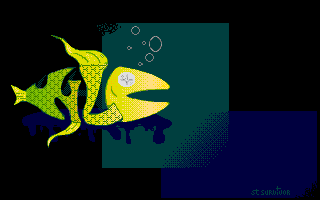
This is another NLC logo I did back in the mid 90s. Again painted on paper and then redone on the STe. This is another example of a logo made up of funny letters. It also heavily uses Crackart's automatic dithering feature ! Colors are poorly used and the background looks like shit, I agree with you :)
Add comments : Can't remember if it was ever used ! Maybe in a long time forgotten Toxic Mag intro ??
Previous Back to Main Gallery Next